Connecting Communities, One Bite at a Time
Overview
ZipLunch connects hungry users with local restaurants based on proximity, cuisine, and prep time. I owned the experience end‑to‑end, from framing the problem and mapping the ordering flow to prototyping, testing, and defining the launch metrics.
Role
Product Designer
Impact
10k+
Downloads
30%
User Retention

WE FOUND THAT
Food delivery is currently a $93 Billion Industry
15% of food is ordered from the workplace, globally
Conclusions from competitor analysis
The competition strived to make it simple without thinking too much
Increased third party delivery
In-house restaurant delivery fleets
Tech giants moving in on food delivery
Rapid online grocery growth
A rise in food delivery subscriptions
Reorder items you have previously ordered
THE Problem
Decision Fatigue
Hungry people lose time finding something nearby. People bounced between maps, review apps, and menus just to decide.

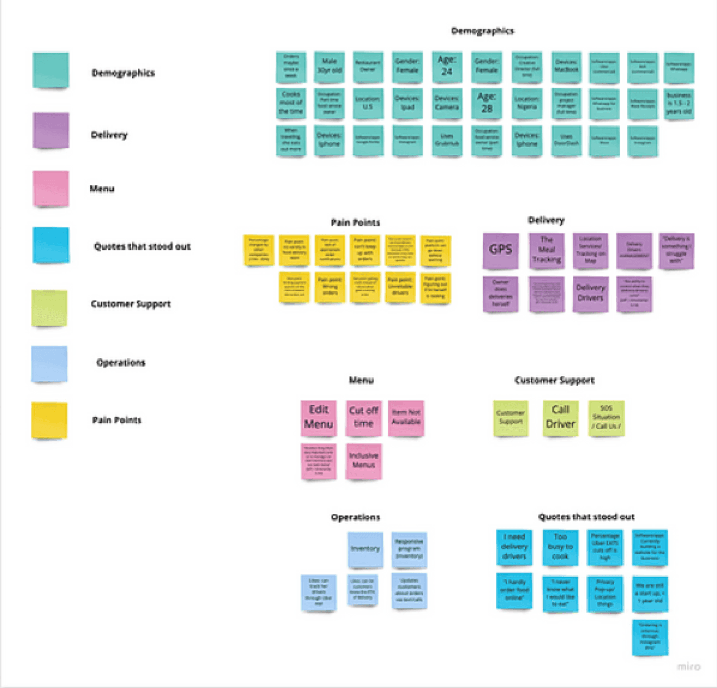
Affinity Map
User Needs
To get more insights from potential users, we set out to interview 11 users provided by ZipLunch. We crafted a contingency plan in the event of no-shows and we were able to complete 6 user interviews.

Maya Patel
User Persona
Gender: Female
Age: 30
Profession: Wedding Planner
Location: New York, NY
Marital Status: Married
Maya (30) has a 45 - 60 minute lunch window and wants a good vegetarian option fast, with no surprises. She gets stuck bouncing between apps, hidden fees show up late, long menus bury best‑sellers, ETAs feel unreliable, and checkout takes too many taps.
ZipLunch ranks nearby places by time‑to‑eat, shows top sellers and fees upfront, lets her pay in one tap, and gives a ready‑by time, so she orders in ~3 minutes.
USER PERSONA
Meet Our User
To bring this to life, we created a persona that embodies their motivations and frustrations. We designed for people who values simplicity, speed, and trust.
Understanding the User
Overview of Research
We conducted a lean, agile research sprint to understand our target users and the challenges they faced. This enabled us to validate our hypothesis.
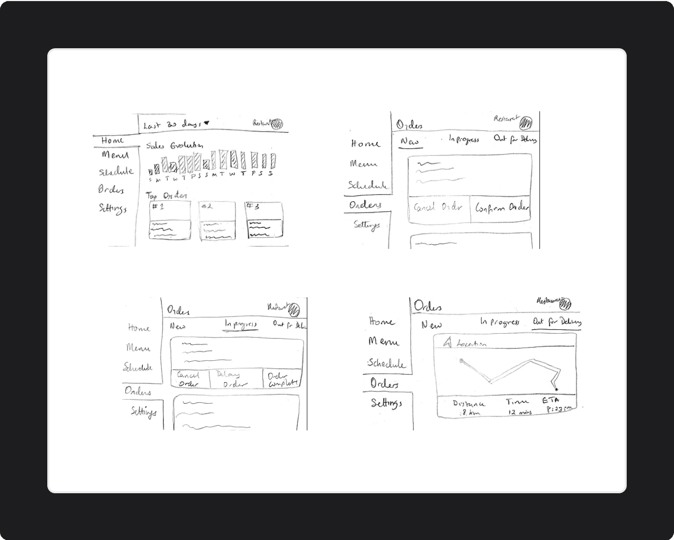
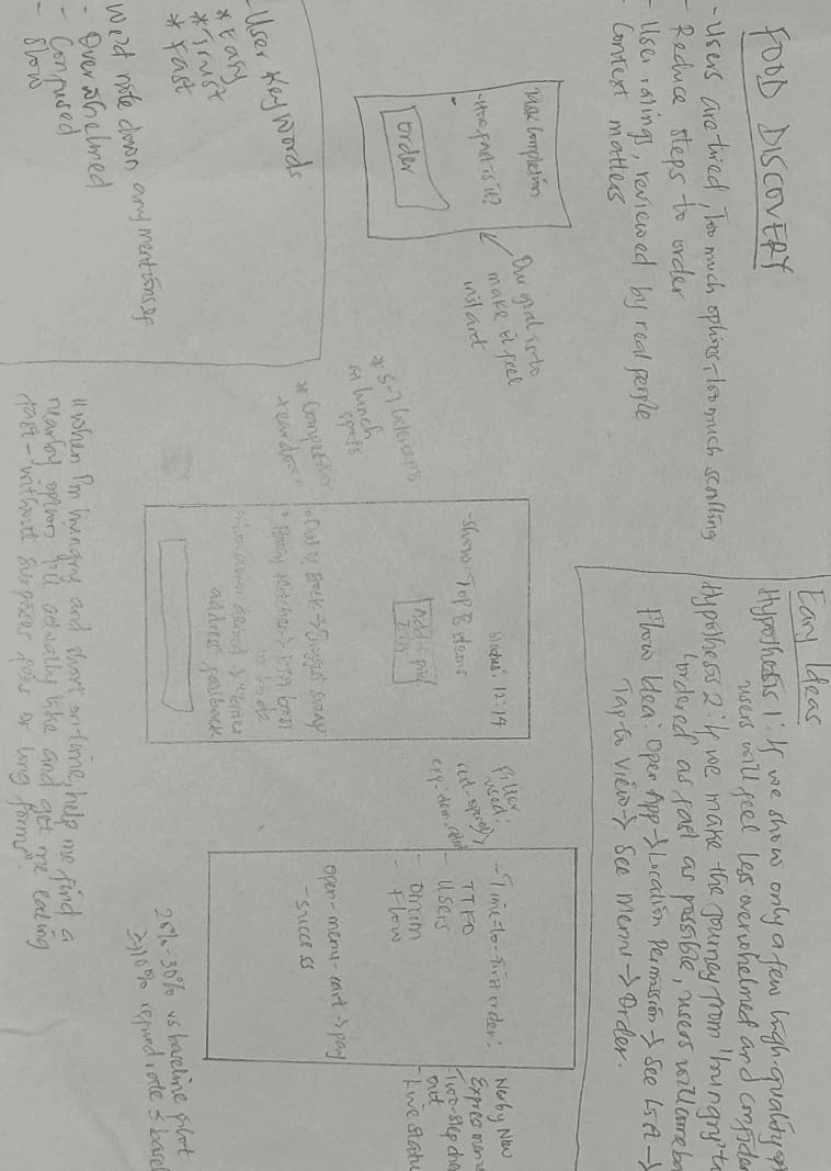
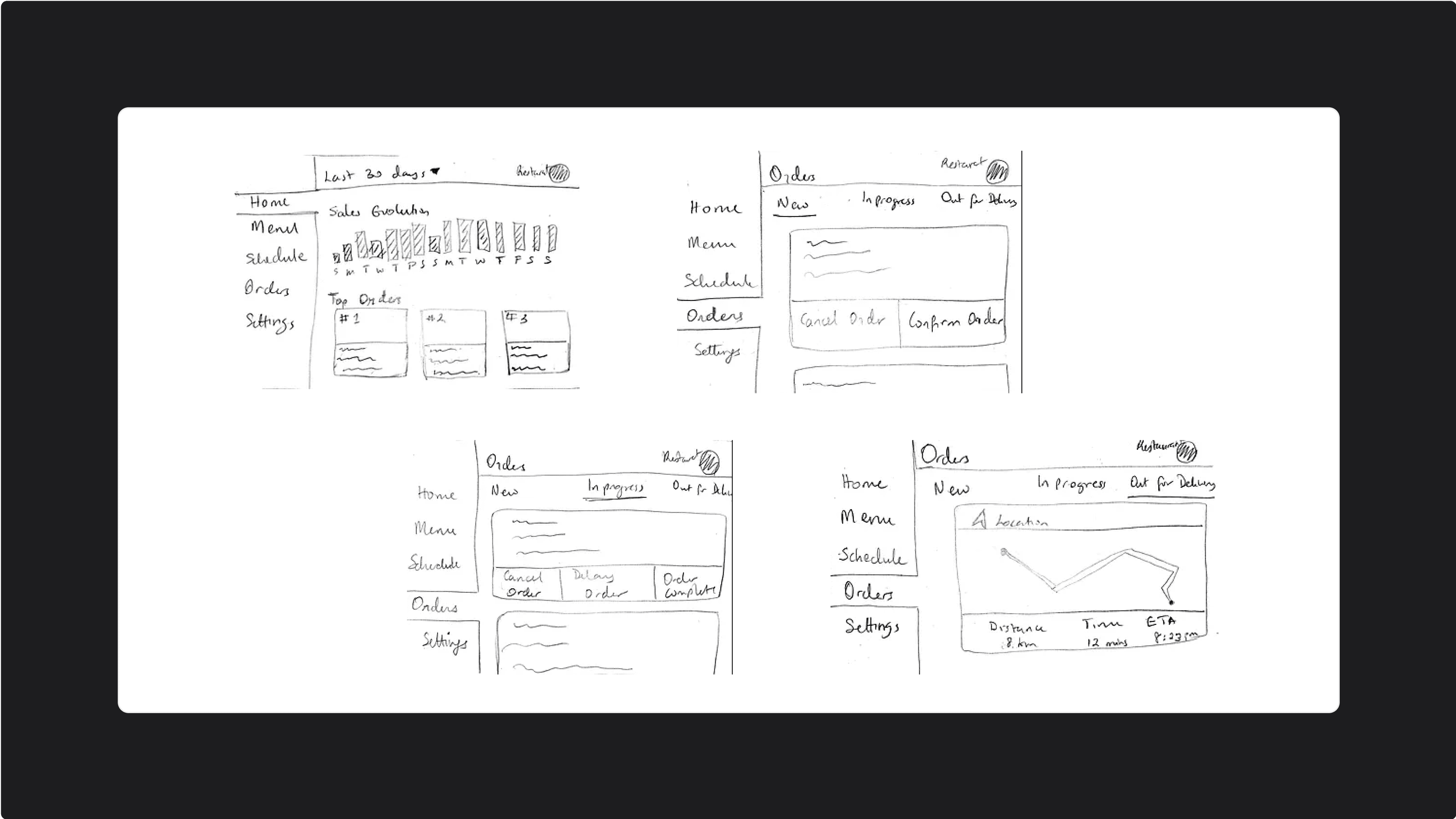
Low-fi Wireframes
Ideation
Once the core problems and user needs were validated through research, I transitioned into the ideation phase to begin shaping practical solutions.
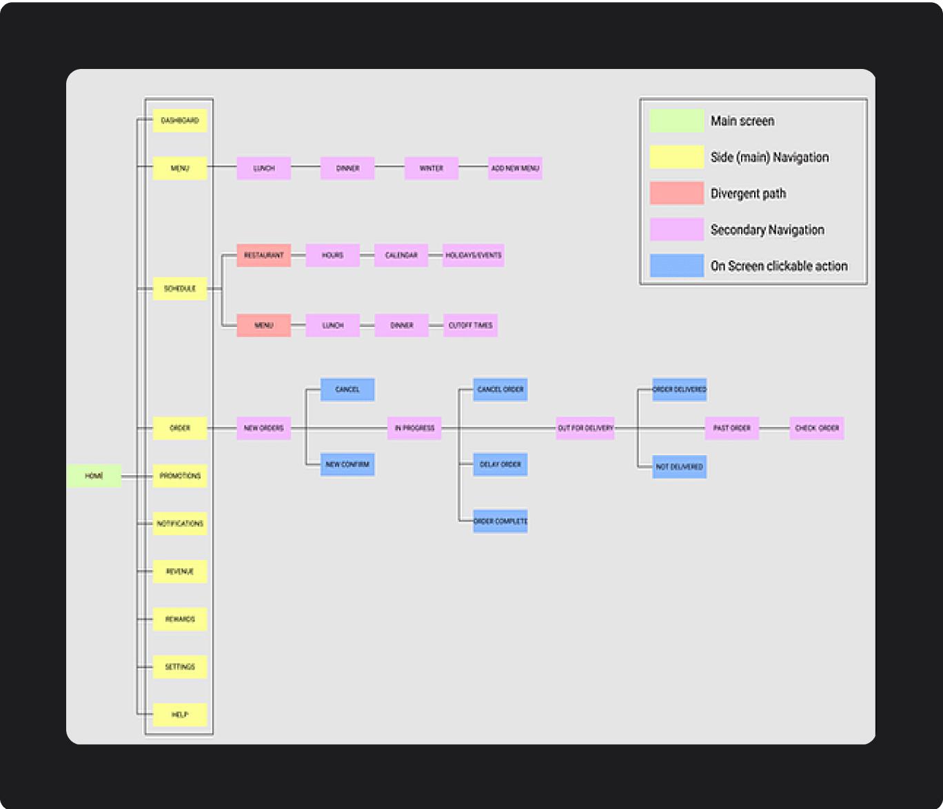
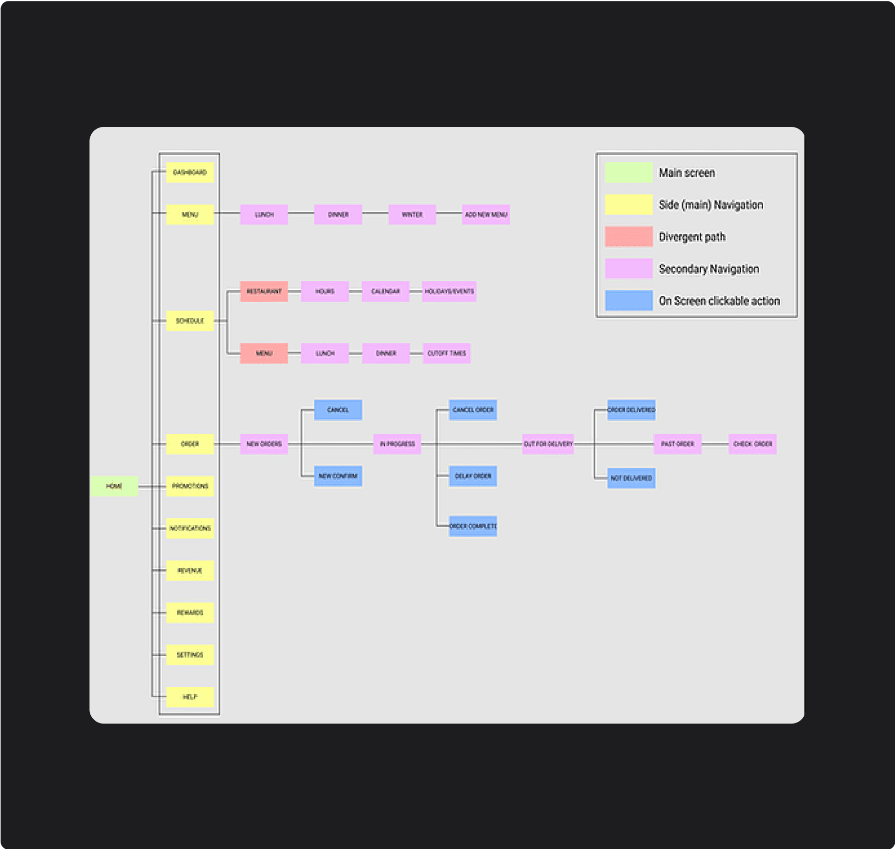
Site Map
Defining The Journey
As we converged our designs, we created a site map that showed the structure, content and functions of the restaurant UI.
⚠️ Must Have
Nearby Now ranking
Express Menus
Two‑step checkout with fees upfront + Apple/Google Pay option
Ready‑by time + live status (prepping → ready → picked up)
Pickup vs Delivery toggle (default to whichever is faster)
✅ Should Have
Quick filter chips
Restaurant detail
Reorder past orders (one‑tap repeat)
Saved payment + address for faster repeats
Map/List toggle for nearby options
❓ Could Have
Promo codes & loyalty (Zip+ subscription later)
Group ordering / split bill
Schedule order (pickup or delivery later)
In‑app chat with the restaurant
Dynamic fee
💡 What I Implemented
Nearby Now ranking
Express Menus with one‑tap add + light upsell
Transparent, two‑step checkout (fees shown early)
Ready‑by timestamp & live status with basic notifications
Smart default to pickup or delivery (toggle always visible)
Feature Prioritization
Meeting Immediate Needs
I ranked features by user impact and build effort to shorten the path from see → choose → eat.
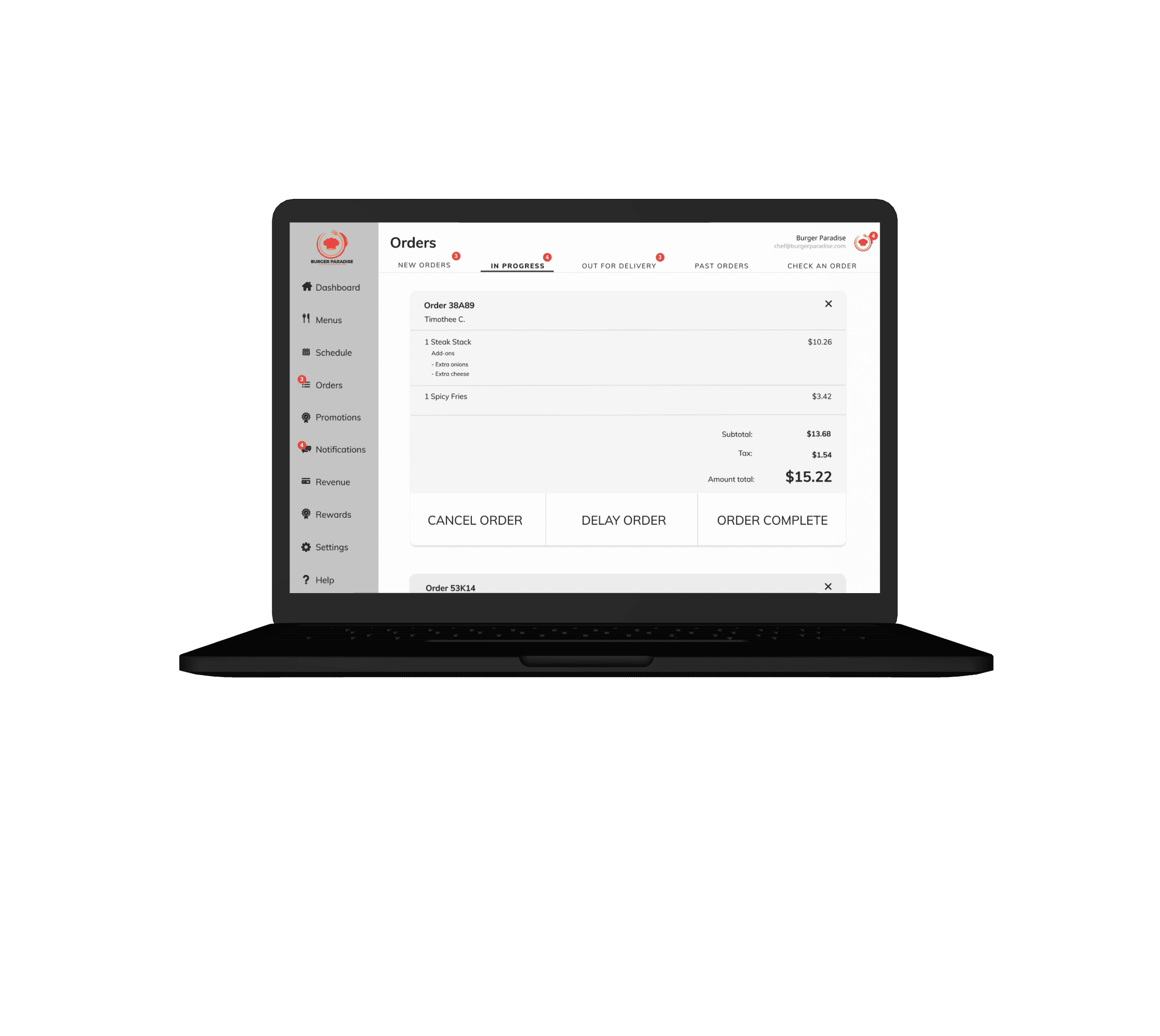
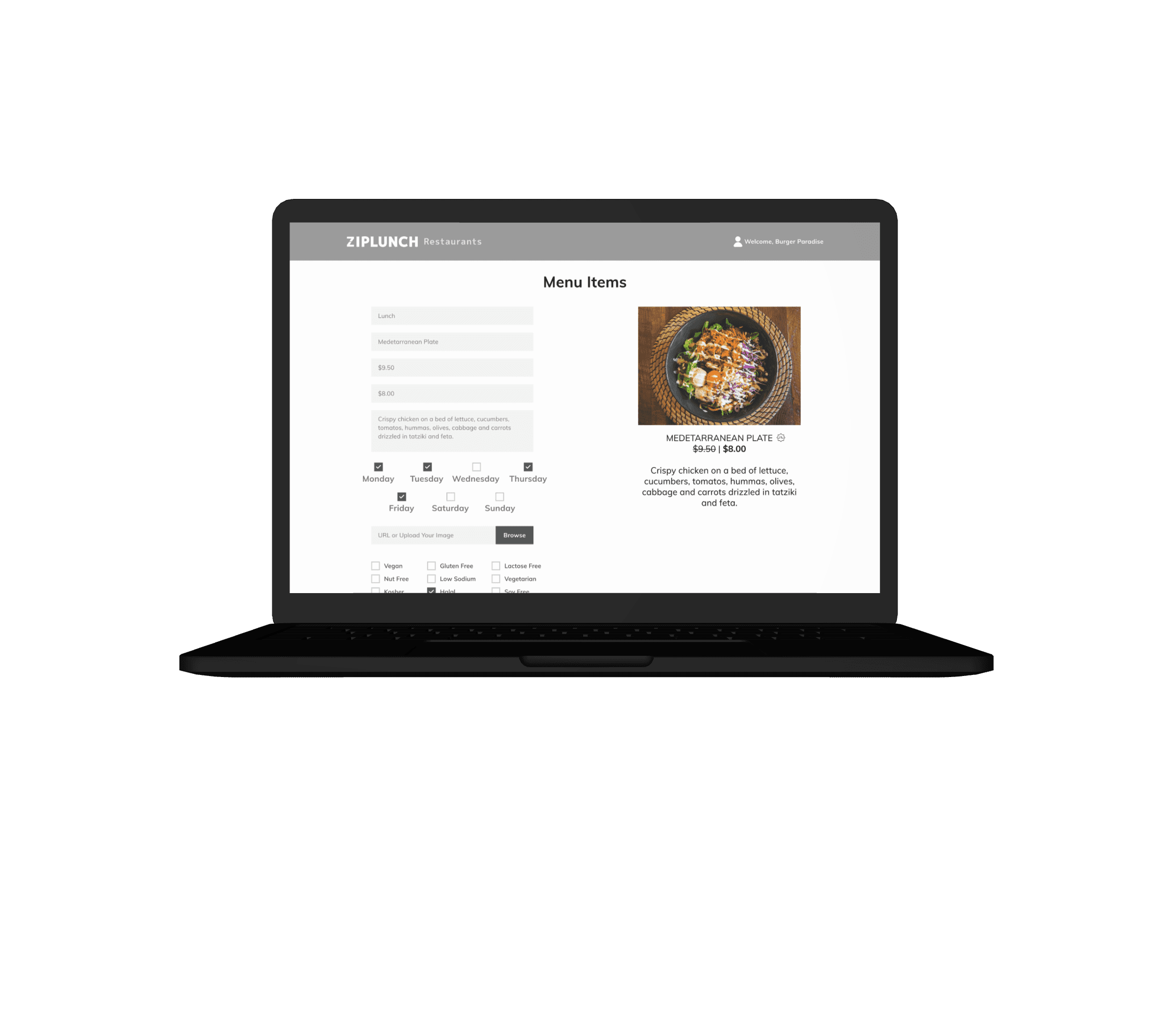
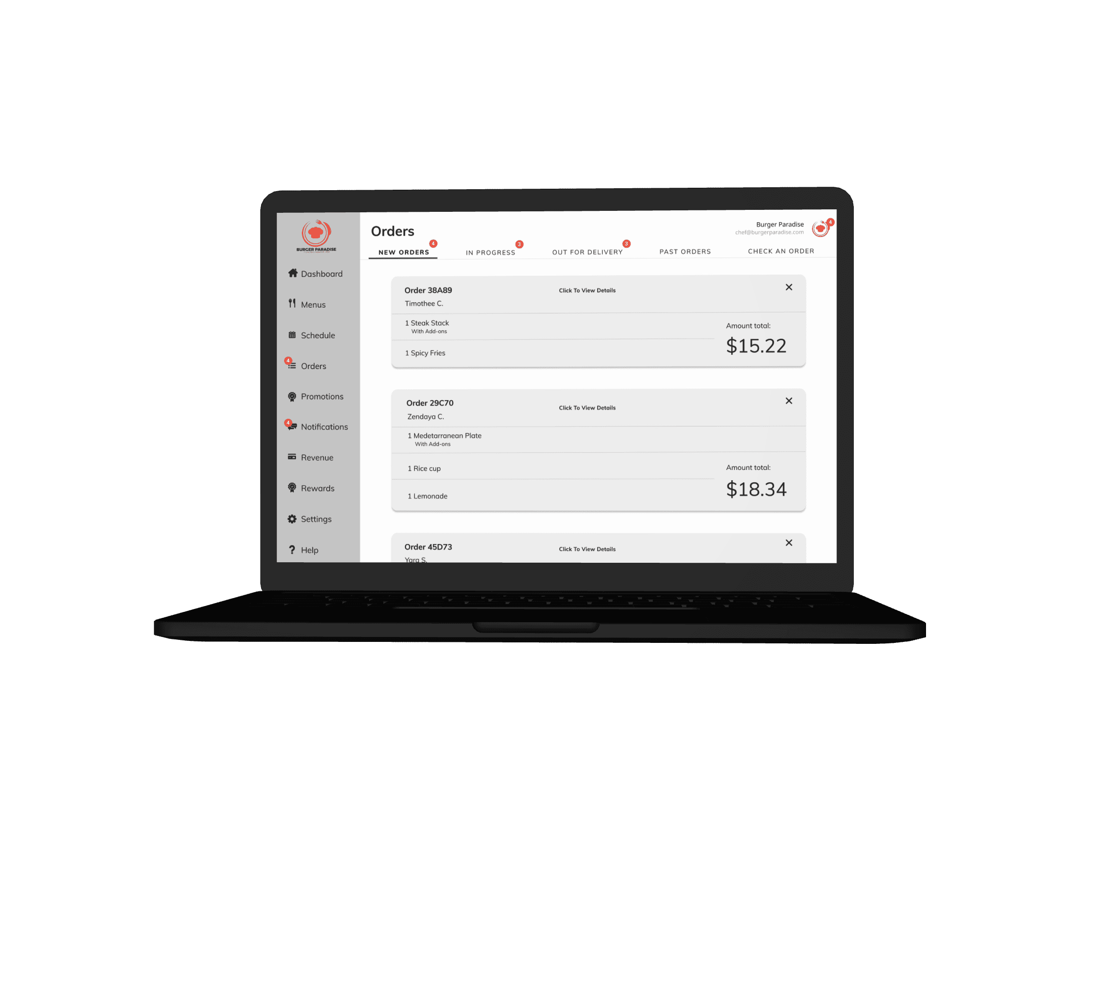
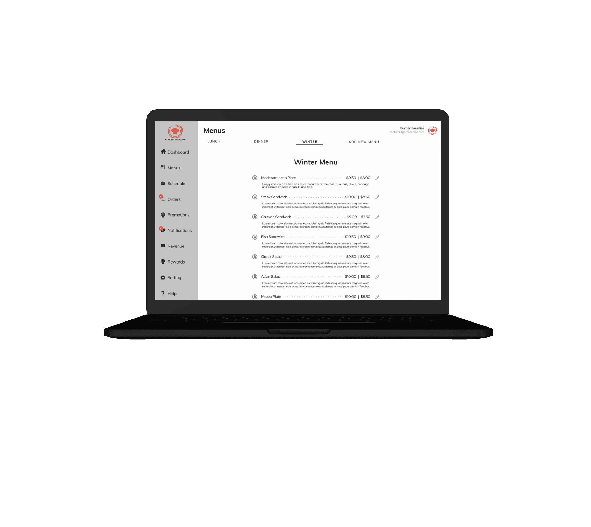
Hi-Fidelity Design
Mockups
We moved to a high-fidelity prototype that brought our vision to life. Each iteration was a response to a user insight, ensuring the final product was intuitive, delightful, and, most importantly, ready for the market.
What I learned
Show fees early and keep checkout to two clear steps, this keeps things simple for users. Suggest whichever is faster, pickup or delivery, but make it easy to switch.
Conclusion
ZipLunch improved how fast people get food they’ll actually eat, by ranking for time‑to‑eat, trimming menus to best‑sellers, making fees transparent, and guaranteeing a clear “ready‑by” moment.
Connecting Communities, One Bite at a Time
Overview
ZipLunch connects hungry users with local restaurants based on proximity, cuisine, and prep time. I owned the experience end‑to‑end, from framing the problem and mapping the ordering flow to prototyping, testing, and defining the launch metrics.
Role
Product Designer
Impact
10k+
Downloads
30%
User Retention
WE FOUND THAT
Food delivery is currently a $93 Billion Industry
15% of food is ordered from the workplace, globally
Conclusions from competitor analysis
The competition strived to make it simple without thinking too much
Increased third party delivery
In-house restaurant delivery fleets
Tech giants moving in on food delivery
Rapid online grocery growth
A rise in food delivery subscriptions
Reorder items you have previously ordered
THE Problem
Decision Fatigue
Hungry people lose time finding something nearby. People bounced between maps, review apps, and menus just to decide.
Affinity Map
User Needs
To get more insights from potential users, we set out to interview 11 users provided by ZipLunch. We crafted a contingency plan in the event of no-shows and we were able to complete 6 user interviews.
Maya Patel
User Persona
Gender: Female
Age: 30
Profession: Wedding Planner
Location: New York, NY
Marital Status: Married
Maya (30) has a 45 - 60 minute lunch window and wants a good vegetarian option fast, with no surprises. She gets stuck bouncing between apps, hidden fees show up late, long menus bury best‑sellers, ETAs feel unreliable, and checkout takes too many taps.
ZipLunch ranks nearby places by time‑to‑eat, shows top sellers and fees upfront, lets her pay in one tap, and gives a ready‑by time, so she orders in ~3 minutes.
USER PERSONA
Meet Our User
To bring this to life, we created a persona that embodies their motivations and frustrations. We designed for people who values simplicity, speed, and trust.
Understanding the User
Overview of Research
We conducted a lean, agile research sprint to understand our target users and the challenges they faced. This enabled us to validate our hypothesis.
Low-fi Wireframes
Ideation
Once the core problems and user needs were validated through research, I transitioned into the ideation phase to begin shaping practical solutions.
Site Map
Defining The Journey
As we converged our designs, we created a site map that showed the structure, content and functions of the restaurant UI.
⚠️ Must Have
Nearby Now ranking
Express Menus
Two‑step checkout with fees upfront + Apple/Google Pay option
Ready‑by time + live status (prepping → ready → picked up)
Pickup vs Delivery toggle (default to whichever is faster)
✅ Should Have
Quick filter chips
Restaurant detail
Reorder past orders (one‑tap repeat)
Saved payment + address for faster repeats
Map/List toggle for nearby options
❓ Could Have
Promo codes & loyalty (Zip+ subscription later)
Group ordering / split bill
Schedule order (pickup or delivery later)
In‑app chat with the restaurant
Dynamic fee
💡 What I Implemented
Nearby Now ranking
Express Menus with one‑tap add + light upsell
Transparent, two‑step checkout (fees shown early)
Ready‑by timestamp & live status with basic notifications
Smart default to pickup or delivery (toggle always visible)
Feature Prioritization
Meeting Immediate Needs
I ranked features by user impact and build effort to shorten the path from see → choose → eat.
Hi-Fidelity Design
Mockups
We moved to a high-fidelity prototype that brought our vision to life. Each iteration was a response to a user insight, ensuring the final product was intuitive, delightful, and, most importantly, ready for the market.
What I learned
Show fees early and keep checkout to two clear steps, this keeps things simple for users. Suggest whichever is faster, pickup or delivery, but make it easy to switch.
Conclusion
ZipLunch improved how fast people get food they’ll actually eat, by ranking for time‑to‑eat, trimming menus to best‑sellers, making fees transparent, and guaranteeing a clear “ready‑by” moment.